Concrete reverie: from furniture to origami, this is Brutalism as you’ve never seen it before
Brutalist architecture still dominates many New East cityscapes, a controversial heritage of the socialist past. Now young designers are using these stark, concrete forms as inspiration for a fresh wave of products, from furniture to origami
18 September 2018
Text
Katie Marie Davies
Bold and unforgiving, the Brutalist landmarks and modernist housing estates which sprang up across Europe in the wake of the Second World War still dominate cities in the former Eastern bloc. They divide opinion without mercy, pitting those who praise the buildings’ futuristic vision and uncompromising form against those who condemn the once-lauded structures as grey, jarring eyesores.
The Calvert Journal talked to designers and creatives across the New East who are now reclaiming socialist-era Brutalism as a driving force behind their work, changing mindsets, updating old designs for the modern age and making their own statements on gentrification, nostalgia and innovation.
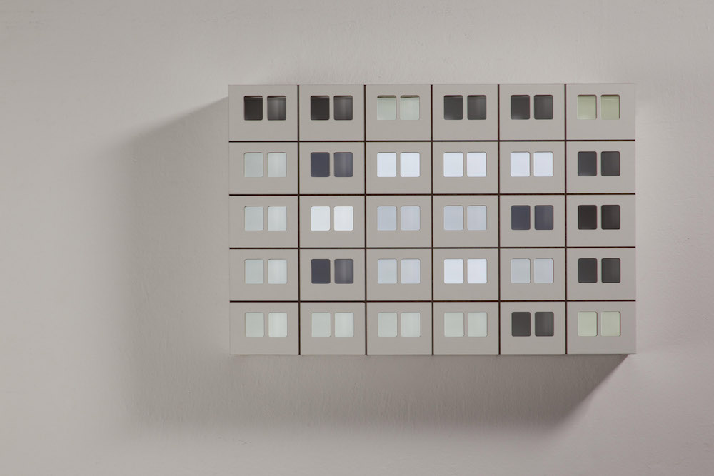
St Petersburg-based artist Katia Tolstykh draws inspiration from the buildings that surround her: the geometric shapes of the area’s Brutalist cityscapes and the concrete park furniture which litter the city’s courtyards. Decorated with pastel hues, her MEME vases showcase unfinished surfaces and the unusual use of conventional forms. “Brutalism is a big inspiration for me,” says Tolstykh. “It is a unique style born out of the fusion of cultural protest and a harsh urban need. Post-war Europe was in dire need of rebuilding: reinforced concrete was ideal for these purposes.”
But as well as its social aspirations, Tolstykh believes that artists and designers are drawn to Brutalism for other reasons, among them the need to express themselves. “The other side of Brutalism is its anti-bourgeois protest,” she says. “It’s a style which screams [about] how architects don’t just want philistinism or pastoral beauty. They crave rough, heavy, hard forms: forms which will capture the spirit.’
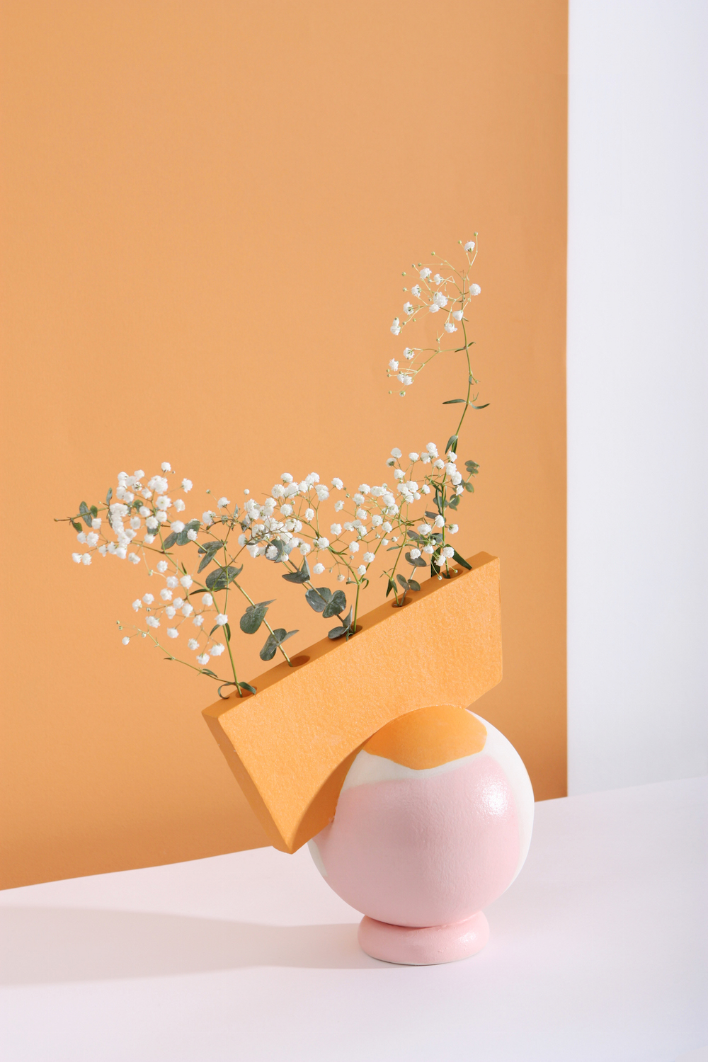
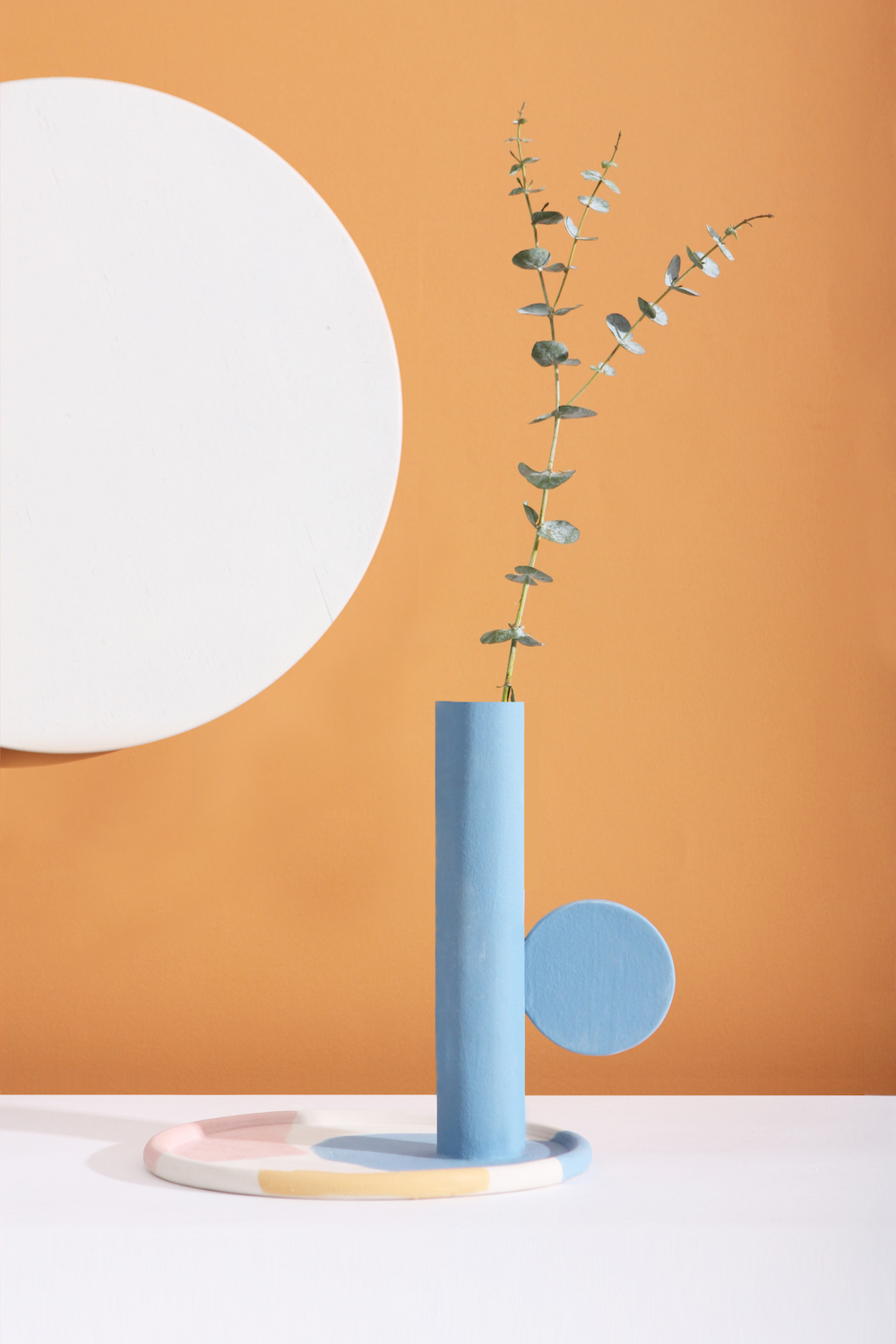
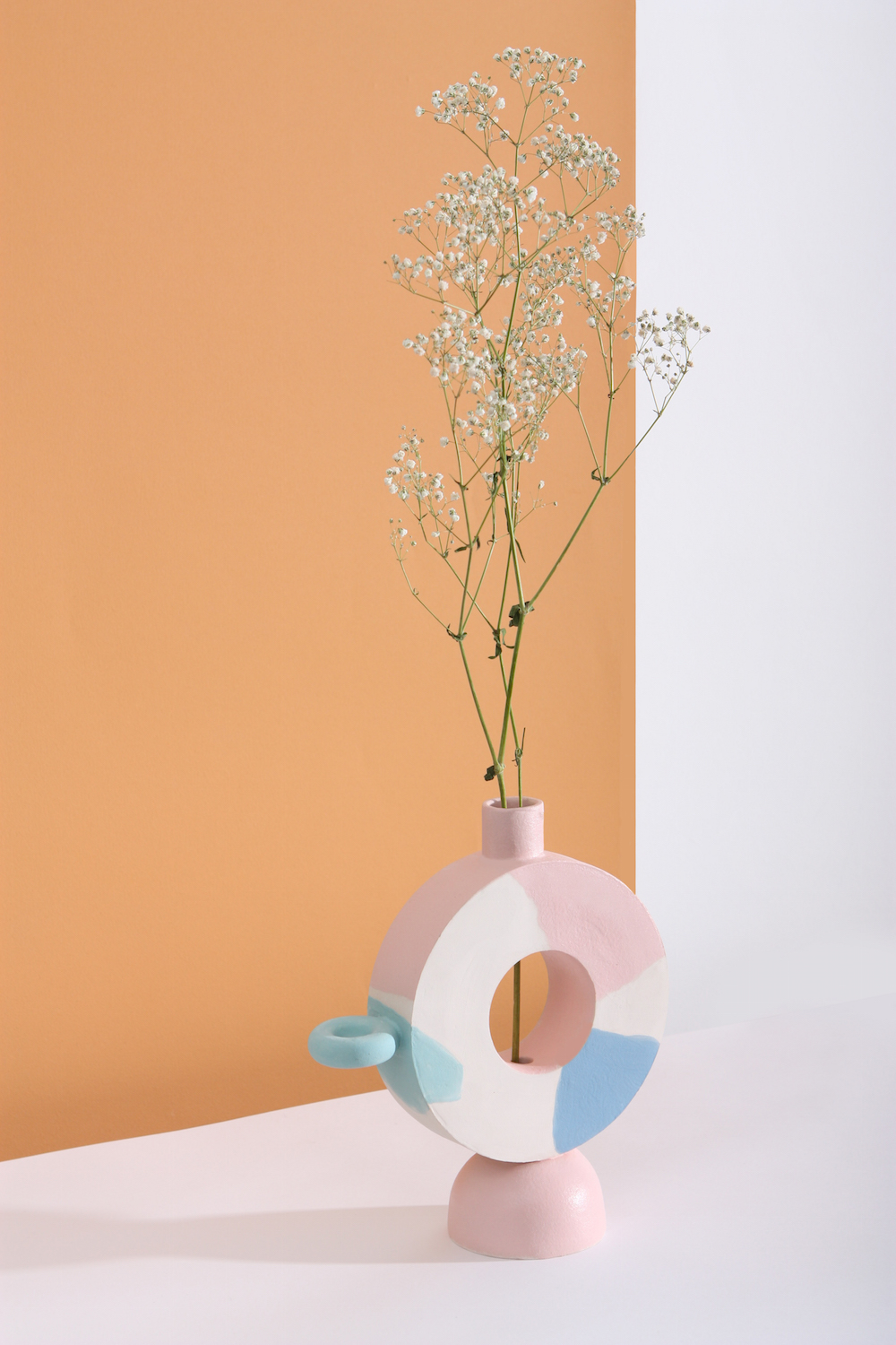
Images: Katia Tolstykh
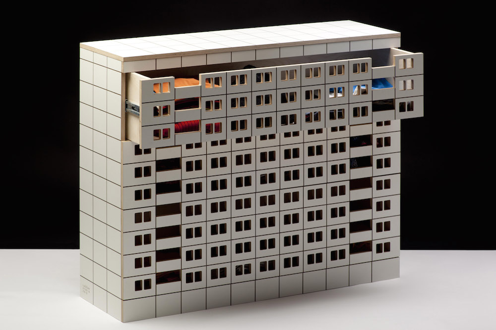
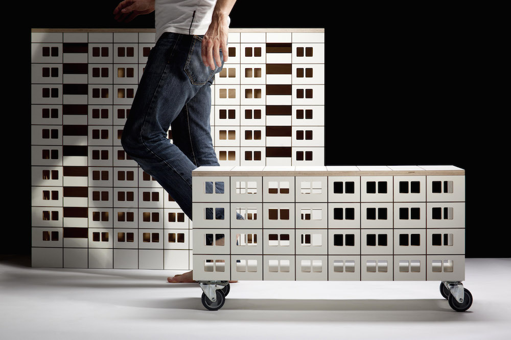
Slovak designer Marián Laššák doesn’t see the country’s boxy, pre-fab panelák — the tower blocks which sprouted up across communist Czechoslovakia after the Second World War — as a problem. Instead, he sees them as an integral part of the country’s visual memory, a rich seam of retro design nostalgia to be tapped into: just as other creatives might with their own history in the West. His Panelák furniture is dominated by a sense of playfulness, decorated with lights and peek-through windows. “We’re always looking back and taking inspiration from old products and how they were made. Even though they were created under communism, they are still inspirational because of their modernity,” says Laššák.
But this rehabilitation has been hard work. It has taken extensive refurbishment to dislodge much of the ill-feeling towards the tower blocks. “Just after the revolution, the panelák was a symbol of bad housing, a sensitive topic that traumatised society,” says Laššák. “I do not think it’s such a topic anymore. They look completely different: insulated, re-painted. They provide a more humane living environment now. Nowadays, these panel houses are just retro, a symbol of that time. They influenced the lives of generations and it brings meaning which changes according to the individual stories of every one of us.”
Images: Academy of Fine Arts and Design – Studio of advertising photography
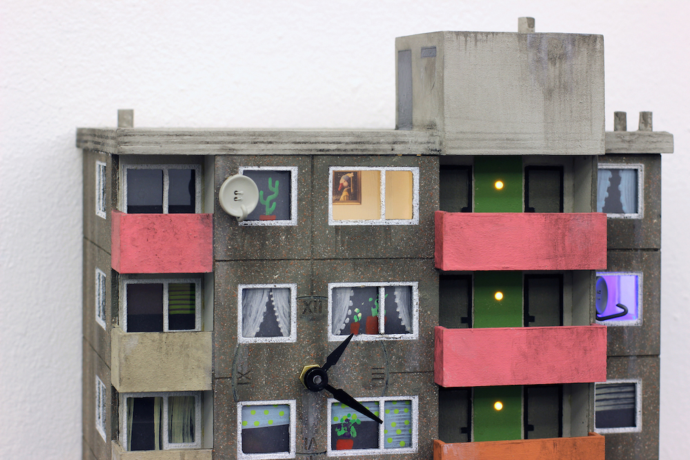
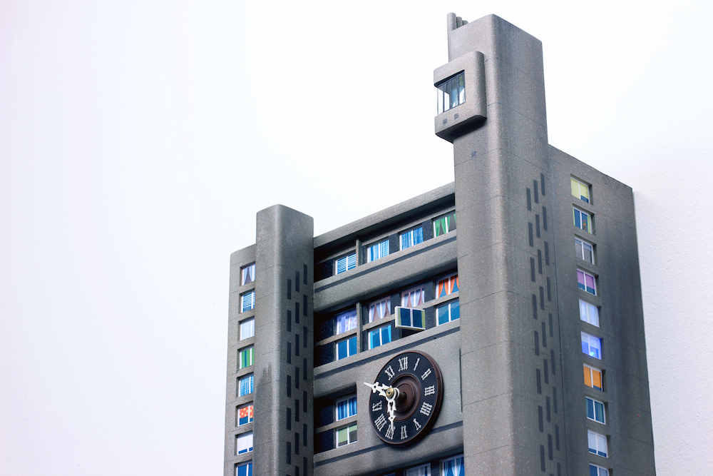
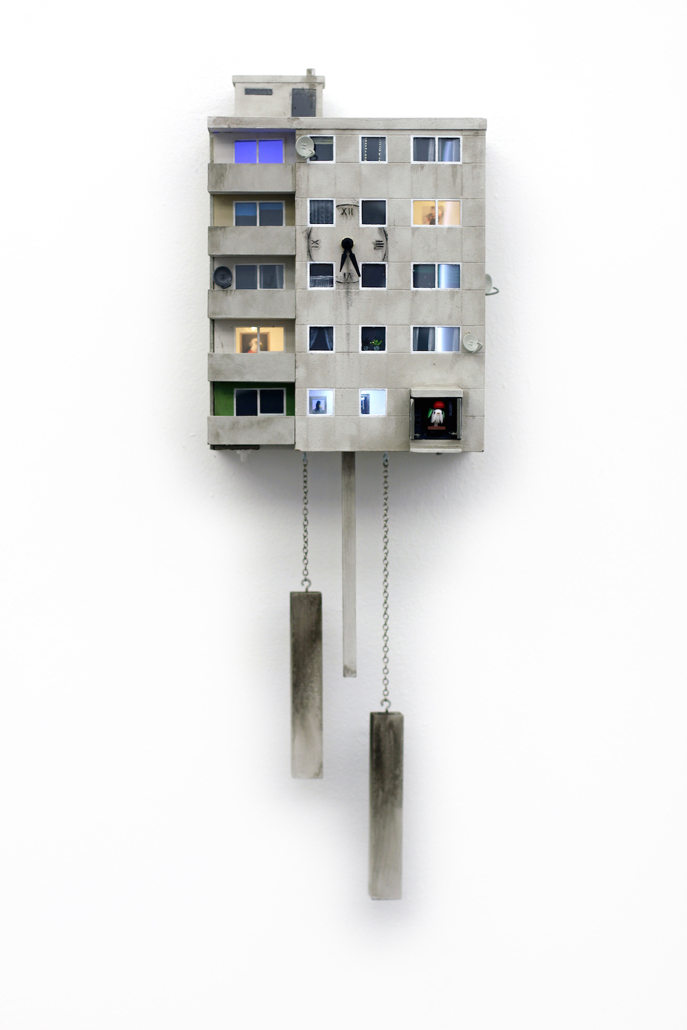
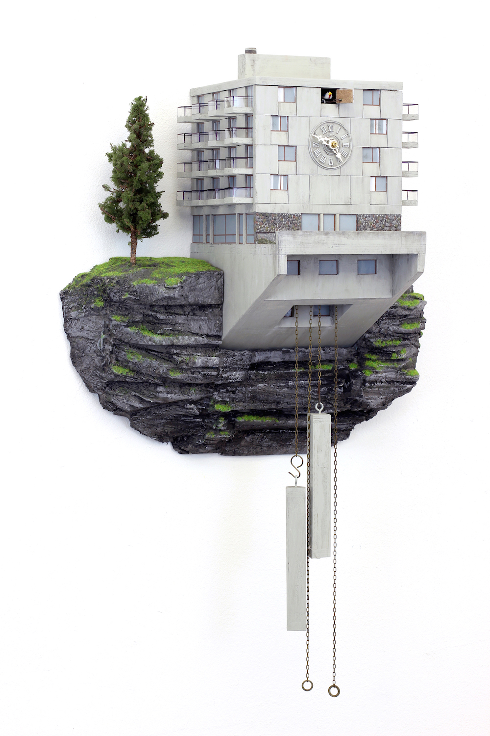
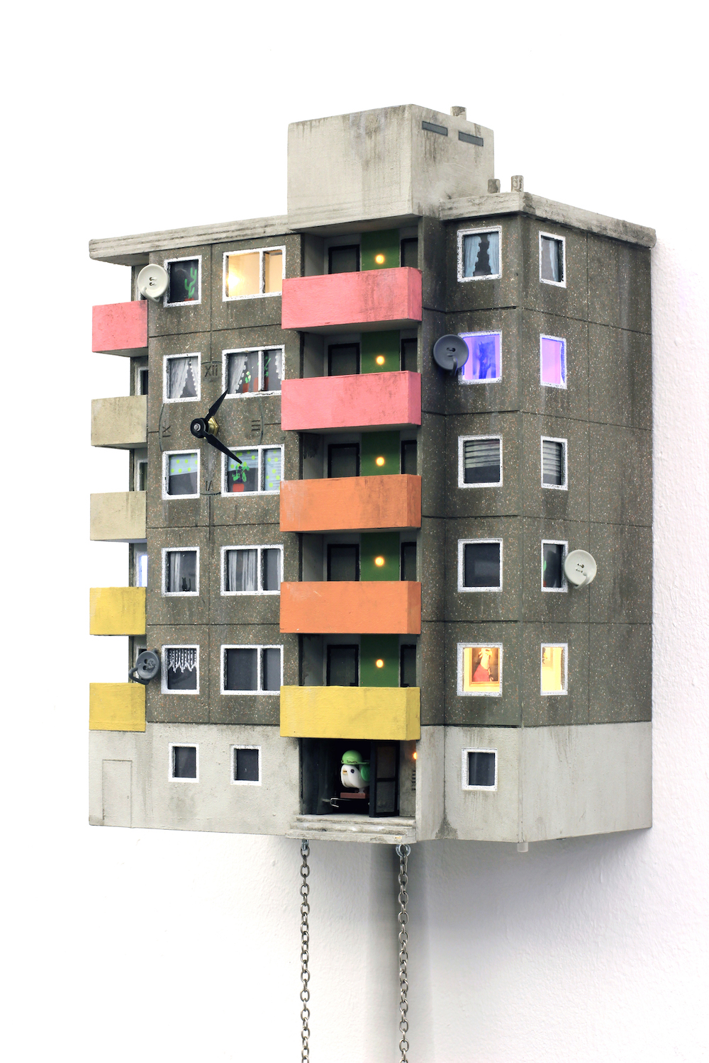
With waves of gentrification sweeping European capitals, once-shunned social housing is now prime concrete real estate. Artist Guido Zimmerman fuses this new, unexpected symbol of affluent hipster living with an older relic from Germany’s middle class: the traditional cuckoo clock. Just as older models from Bavaria once gave rising social climbers a taste of the “ideal” traditional cottage, the Cuckoo Block frames post-war buildings as the enviable city homes they are now are.
Guido maintains that while the carapace is new, the clock’s soul — with its emphasis on craftsmanship — remains an old one. Now the traditional cuckoo pops its head through painstakingly recreated apartment block windows. “I think that the beautiful examples of Brutalism will never lose their spirit,” says Guido. “But while Glenkerry House by Ernő Goldfinger once offered accommodation for average citizens, for example, now it offers “hip” and hardly-affordable living.”
Images: Guido Zimmerman
Blue Crow Media started life back in 2008, publishing food and drink guides for cities around the world. Then it tumbled into a niche community of tower block fanatics. The company’s design maps — guiding tourists between architectural landmarks — began in 2015 with a guide to Brutalist London, inspired by the capital’s imposing Barbican Centre. The team now have 16 different architecture and design maps, spanning Sydney, New York and Tokyo. Most, however, focus on the best modernism, Constructivism and Brutalism from eastern Europe. “I couldn’t believe that no one had done it yet,” says founder Derek Lamberton. “I’ve always liked [Brutalist buildings],” says Lamberton. “They’re not something that should be written off because they’re concrete or social housing.”
But Lamberton admits that attitudes toward modernist architecture are far more emotionally-charged in the former eastern bloc. While many in the West associate Brutalist buildings with the optimism of the 60s, others in eastern Europe would prefer to see them torn down as reminders of socialist oppression, rather than celebrated. “I’m always sensitive about how I present what I’m doing there,” he says. “So much depends on a person’s experiences and their family’s experiences during that era. We had a launch in Belgrade and one woman asked us, ‘what on earth are you doing? Tito was terrible.’”
For architects and academics on the ground however, the maps mark a new way of changing mindsets. “We have already lost some of the prominent buildings of the modernist era in Belgrade, all with the blessing of local institutions,” says Ljubica Slavković, an architect and researcher who worked with Blue Crow Media for their Modernist Belgrade Map. “That is exactly one of the motives why we have done the Modernist Maps — in order to bring more attention to this architecture, urbanism and cultural legacy, and to contribute as much as we can to its adequate valorisation and treatment.”
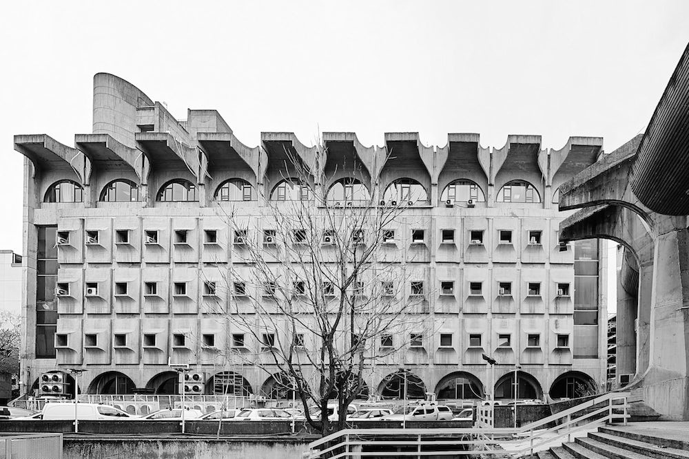
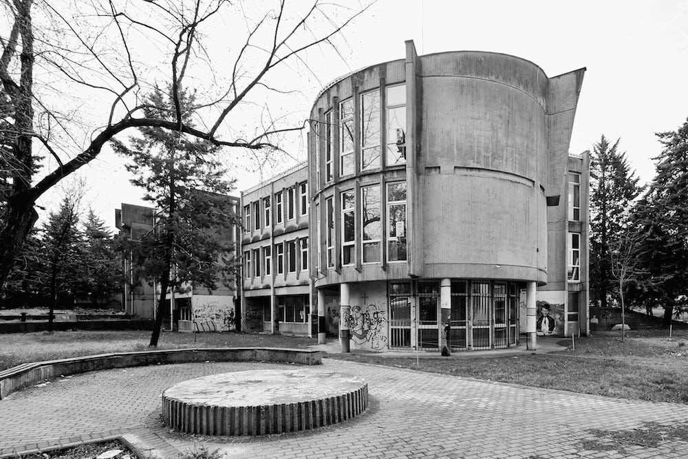
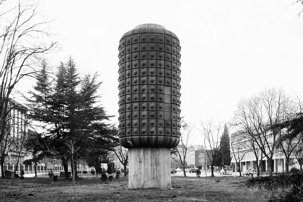
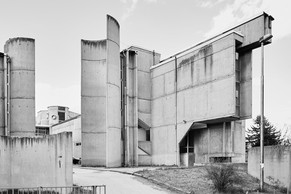
From the Modernist Map of Skopje. Images: Vase Amanito for Blue Crow Media
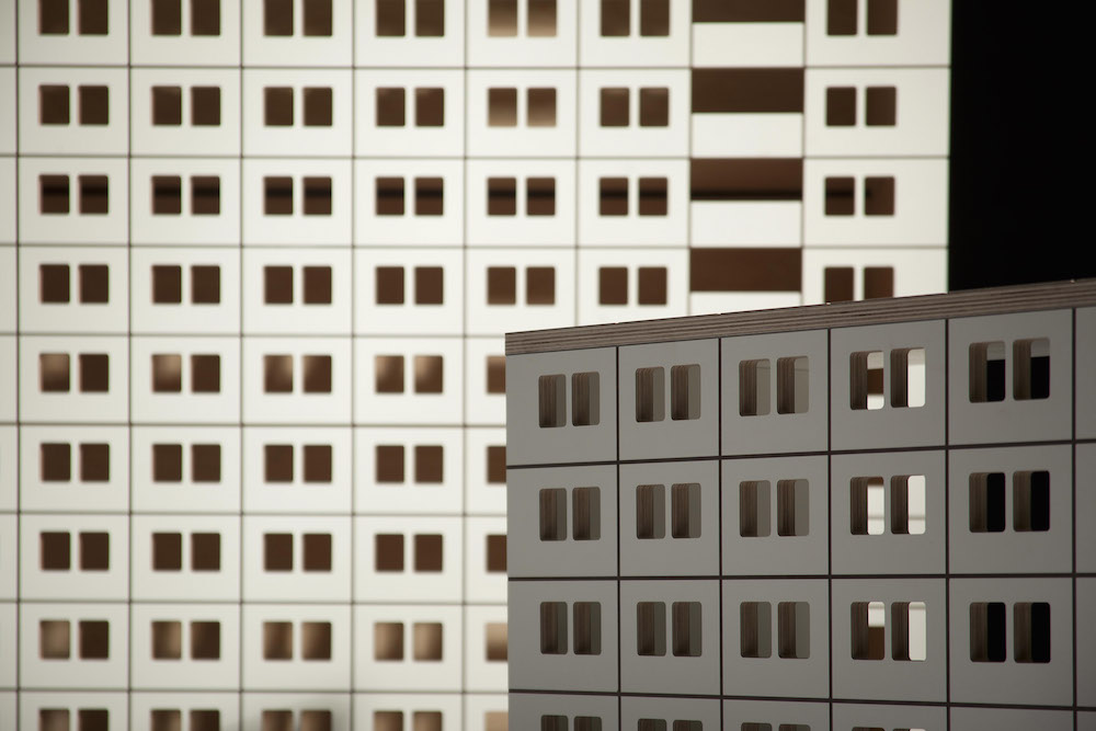
Zupagrafika has captivated the design world with delicate paper recreations of Europe’s hulking concrete landmarks. The brainchild of Spanish graphic designer David Navarro and Polish artist Martyna Sobecka, the team’s Brutalism-inspired work spans New York, London and Berlin, but draws strength from the team’s base in the city of Poznań. For David, it was Polish design — from the Polish Poster School to the boxy outlines of local housing estates — that inspired him to move across Europe. Now, he and Martyna work to help others see the country’s Brutalist blocks as they do: a radical form of expression.
“There are things that surround us on a daily basis that seem to be invisible to us,” says Martyna. “Tower blocks, concrete modernist estates: we take them for granted. We think they are unattractive and not worth our attention. With our graphic work, we have been trying to showcase this kind of architecture from a different perspective.”
The mission has driven the Hidden Cities project. Polaroids are peeled away to reveal snowy cityscapes, snapped among the forgotten sleeping districts of the eastern bloc. “By peeling away the “negative” one learns to rediscover the beauty of the ordinary,” says Martyna.
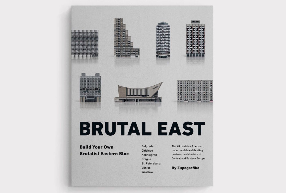
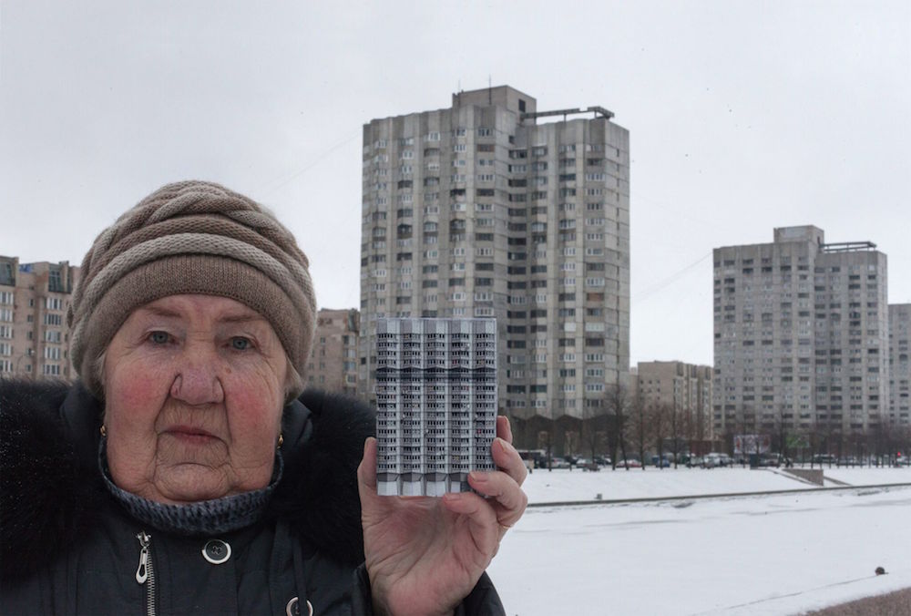
From Brutal East. Images: Zupagrafika, 2017
Text: Katie Davies
Top image from Brutal East by Zupagrafika: “Manhattan” Housing Complex, Wrocław (Poland)