Hometown: graphic designer Anna Kulachek chooses a typeface for Moscow
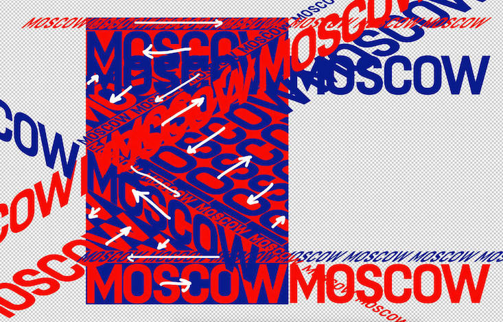
(Artwork: Anna Kulachek / Typeface: FS Dillon, Fontsmith)
(Artwork: Anna Kulachek / Typeface: FS Dillon, Fontsmith)
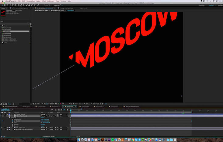
(Image: Clément Pascal)

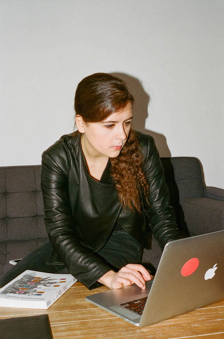
(Image: Clément Pascal)
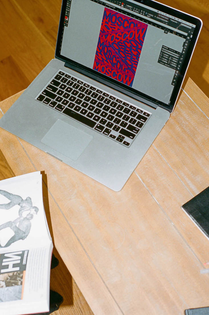
(Image: Clément Pascal)
30 January 2017
Text
Elise Morton
In partnership with London-based type foundry Fontsmith, It’s Nice That has commissioned three creatives to explore the broad scope of type as a medium. Graphic designer and art director Anna Kulachek set out to find the font that best embodies her hometown of Moscow.
The Local Characters series sees the creatives delve into Fontsmith’s exclusive typeface service. Kulachek, whose Moscow poster is first to be annouced, features existing sans-serif Fontsmith typeface FS Dillon.
The Ukrainian-born designer, who is living in New York after an administrative error on the part of Russian immigration, sought a font that would capture the frenetic quality of the Russian capital.
“Moscow is bold. It’s always busy, always bright [...]. I decided I wanted to do a really typographic poster, which would reflect both Moscow’s architecture and traffic. [...] This typeface was the straightest of the Fontsmith fonts, it is bold, just as Moscow is,” Kulachek explains, also commenting on the font’s reflection of what she considers to be prevalent qualities of Muscovites: honesty and straightforwardness.
When it came to the layout of the poster, she drew inspiration from the huge, intimidating housing estates located on the edge of the city, and placed parts of the text at oblique angles to express the unpredictability of Moscow.
“You can never be sure in Russia, you can have a good job, but the next minute the ruble costs nothing, you go to bed rich but you wake up poor. It’s out of your hands. But that’s why I’ve always been curious about Moscow, you never know what is going to happen tomorrow,” Kulachek says, also remarking on the dynamism lent by the clashing red and blue colour scheme, inspired by the Russian flag.
Source: It’s Nice That