Rags and ruins: nine Russian creative projects that celebrate the “poor” and imperfect
From upcycled furniture to ruin photography, today's Russian creatives are embracing their imperfections. Here are nine projects proving that bad has never looked so good
8 March 2016
Text
Ellen Rutten
Stain-covered walls. Tarnished floors. Handwritten signs. This is what visitors see upon entering Taiga Space, a creative platform featuring music studios, galleries, and shops in central St Petersburg. Its tenants come with individual styles — but what the venues share are decidedly wobbly looks. In promoting these looks, Taiga welcomes and responds to a transnational trend — one whose aficionados fetishise the non-perfected as a hallmark of humanness or authenticity in a growingly digitised and mediatised world.
From glitch art to trash fashion, from failure aesthetics to “wrong design” (or, put less formally, a “designerly ‘fuck you’’): between the late 1980s and today, artists, designers, writers, musicians, baristas, typographers, hackers, PR managers increasingly promote errors, noise, rawness, and incompletion. This imperfection cult is of course neither new (think punk, Arts & Crafts or baroque) nor universally monolithic. The non-polished has a different public status for, say, a Dutch designer than for Taiga’s tenants, whose homeland has often been exoticised as a pinnacle of chaotic imperfection. Nineteenth-century intellectuals already framed aesthetic poverty as a Russian cure for western “inauthenticity”. And in Soviet Russia, ragtag aesthetics — in dissident culture, garbage art, and repair cults — ranked as guarantee for political independence.
In not unsimilar moves, Russian creatives today embrace a “culture of craftmanship”; “pretty ugly” suburbs; and “trashy and beautiful” fashion. What do unpolished looks mean to these new makers? To what extent do their aesthetics respond to life under Putin — and to what extent do they blend with global, market- and technology-driven developments? Are trash looks postmodern? Are they (n)Ostalgic? Is wonkiness a successful Russian export product? The following creative projects partially answer these questions, illustrating why Russian creatives glorify aesthetic imperfection with particular vigour today.
Boris Mikhailov
Theatre of War (2014)
Boris Mikhailov, Untitled, from the series Theater of War (2013). Image: Artist
“The eroticism of imperfection.” That is what, according to art theorist Boris Groys, lends Boris Mikhailov’s photographs their allure. Mikhailov nicely illustrates the kinship between Soviet and post-Soviet trash aesthetics: between the 1960s and today, this artist has consistently fetishised the non-polished, with tarnished photos, sloppy-looking collages, and awkwardly unattractive portraits.
In Soviet Russia, Mikhailov offered one of many countercultural, punk-like responses to hypernormative mainstream culture. In post-Soviet Russia, his work became more polished, but his interest in the non-perfected never dwindled. It was tangible at his show at the recent St Petersburg edition of Manifesta in 2014.
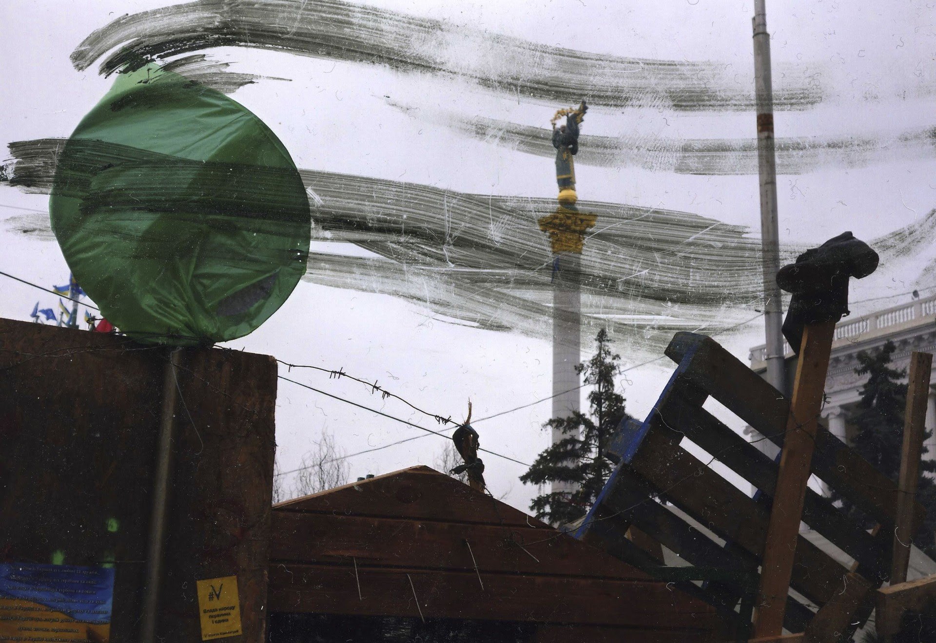
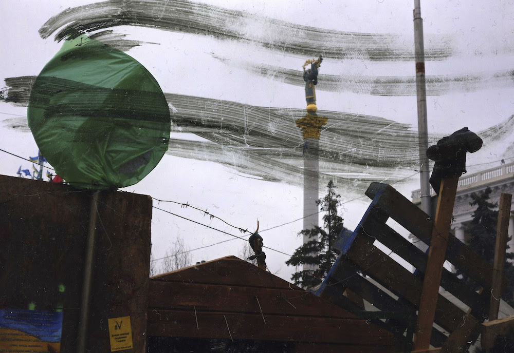
Theatre of War documents life at Kyiv’s Euromaidan in razorsharp shots mixed with hazy blurs, scratches and erasures. The photos tune in with an international trend in which imperfect looks signal social or downright political resistance. At Manifesta, this trend resonates in Thomas Hirschhorn’s, Marlene Dumas’s, and other socially engaged (if never downright activist) exhibits. Mikhailov’s contribution to the show boasts a comparable aesthetic, but it responds to Russian political idiosyncrasies: as always, Mikhailov uses photography to comment on a local and traumatising social reality — in this case, that of Putin-era post-Soviet space.
Vladimir Arkhipov
Home-Made (2006)
 Home-Made
">
Home-Made
">
Toy train. Image Vladimir Arkhipov / FUEL Publishing in Home-Made

Vagharshapat, Armenia. Image: Christopher Herwig in Soviet Bus Stops

Buzludzha Monument, Bulgaria. Image: Rebecca Bathory in Soviet Ghosts
The vexed reality of (post-)Soviet space is what Ryazan-born curator Vadim Arkhipov captures, too, with his collection of home-made Soviet-era artifacts. Arkhipov photographs home-made items — a doormat made of beer bottle tops, a woollen skirt turned child’s hat — and interviews their makers. But rather than trauma reports, his wear-ridden objects form a jumble of happy-go-lucky DIY creations. Arkhipov is not alone: more than one (often emigrated or “western”) photographer nostalgically fetishises post-Soviet Russia’s rags and ruins. In Soviet Ghosts, Rebecca Bathory captures derelict sites in former Soviet Russia. Christopher Herwig — another anglophone photographer who nostalgically admires Soviet looks — photographs run-down Soviet-era bus stops. His and Arkhipov’s work are published in London by Fuel, which also serves up Soviet-era postcards, posters, and tattoos to anglophone audiences — in books where “Soviet” equals hyperstylised scrap aesthetics.
Fuel’s and Arkhipov’s photos caress the eye. But they also risk, in Russianist Jamie Rann’s words, marrying “trendy post-industrial ‘ruin porn’ with the on-going ‘othering’ of Russia.” Not coincidentally are Russian ruins loved especially loudly by non-Russians: historically, so Rann’s colleague Andreas Schoenle argues, “the ubiquity of poverty and devastation ... often left Russians in little mood to aestheticise decay.”
Woodandroot
Oak Root Lamp (2013)
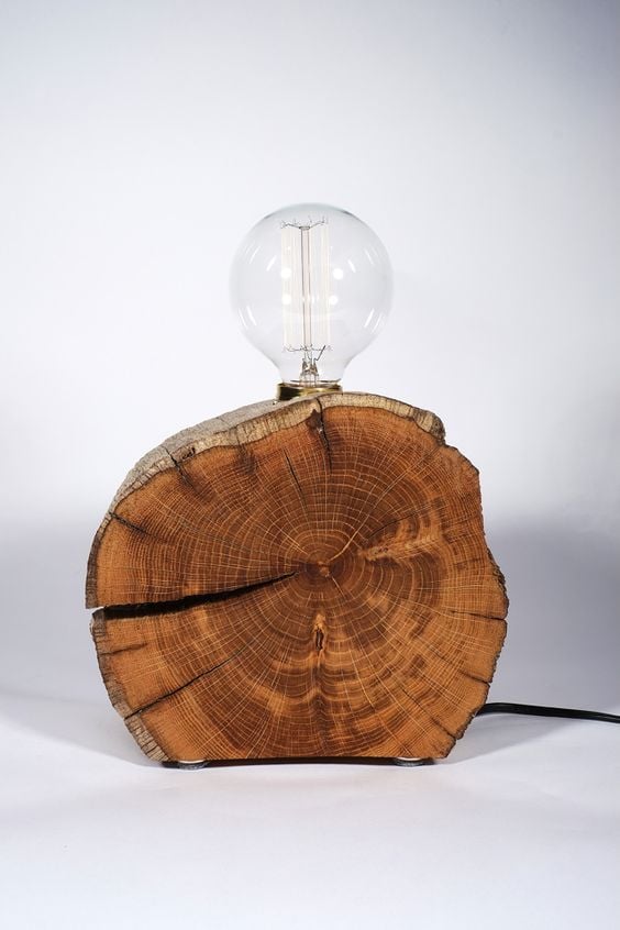
Pavel Mosolov and Zhenia Retinskaia — aka Woodandroot — “upcycle” found material. This lamp was the collective’s first joint design. It oozes a nostalgic-rustic feel that the designers heighten by claiming they merely cut out “bare wood” from a chunk “salted by the sea and disgorged at the Baltic shore”. Woodandroot’s fondness for rough craft blends in with Ostalgia — the transnational nostalgic reverence for Communist-era consumer culture. Tapping into (and partly living off) this nostalgia, Russian craft revivers like Woodandroot nod visibly at old-school Soviet design.
But the Oak Root Lamp builds on more than mere post-Soviet melancholy. It also feeds into a recent artisanal cult both in and outside Russia. And it blends in seamlessly with a trend to playfully appropriate recycled materials in design objects. Dutch designer Piet Hein Eek’s scrapwood cupboard — launched in 1989 by Amsterdam-based design foundation Droog — kicked off this design tradition, which reacts “to the all-pervading perfectionist technology of our time that has been pushing human deficiencies still further into the background” (or so Droog director Renny Ramakers argues).
Taiga Space
St Petersburg (2011-today)
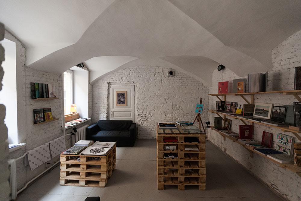
From Detroit to Beijing, revamped villas and factories today celebrate incompletion. Worldwide, (post-)industrial-looking bars, shops, and galleries have mushroomed since the late 1980s. They shape what experts promote as the 21st century’s informal cities. And they emblematise an aesthetic, in contemporary architecture, of imprecision and error (in Russia, Sasha Brodsky’s buildings – the purportedly skewed structure of his restaurant 95 Degrees, for instance — neatly illustrate the same aesthetics). Taiga Space taps into these global trends — although the emphatically ostalgic wolf plushies and wood birds that it sells also wink at Russian history. And the tenants cater for another transnational hype. The shop owners sell quasi-hastily crafted, handmade clothes, toys, and jewels.
Taiga’s residents — who, paradoxically, are mostly tech-savvy youngsters — thus do what Woodandroot’s designers do: they answer technological perfection with an aesthetic preference for handcrafted, non-perfected looks. Taiga’s non-polished aura is easily mistaken for a political (or downright utopian and underground, even) statement. The project offers no political comments a la Mikhailov, however. It can be read as social criticism. Despite rocket-high prices in some Taiga shops, founders and fans call the initiative “a little socialist” — an adjective that, to them, means: aimed at collaborative, non-hierarchical creation.
I’m Thankful For Today
St Petersburg (2015-today)
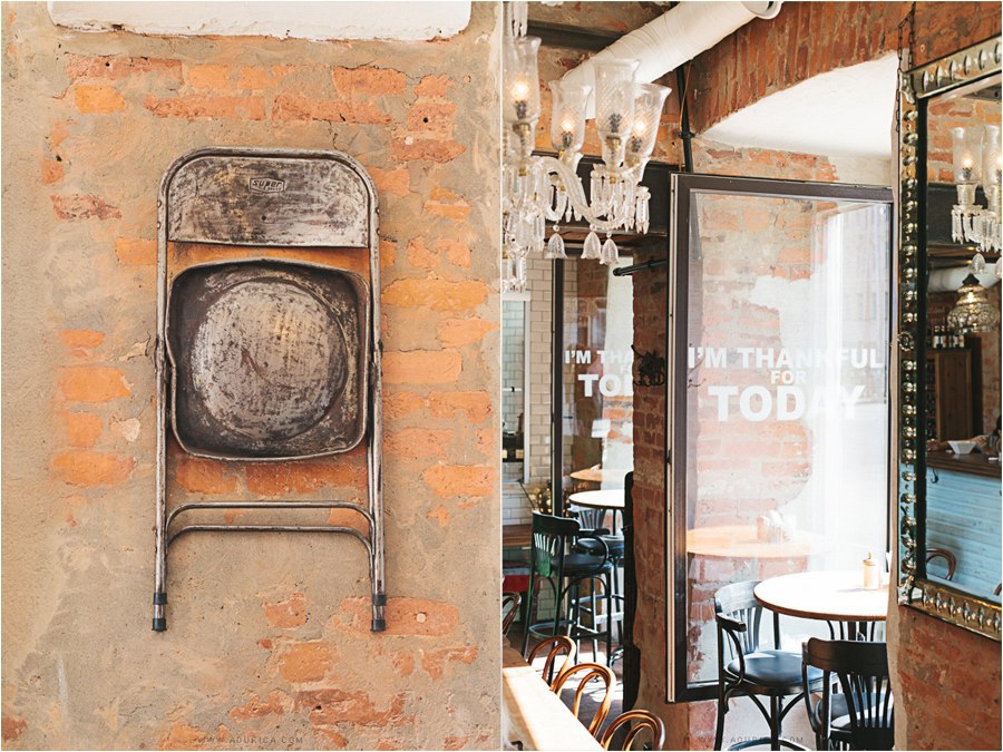
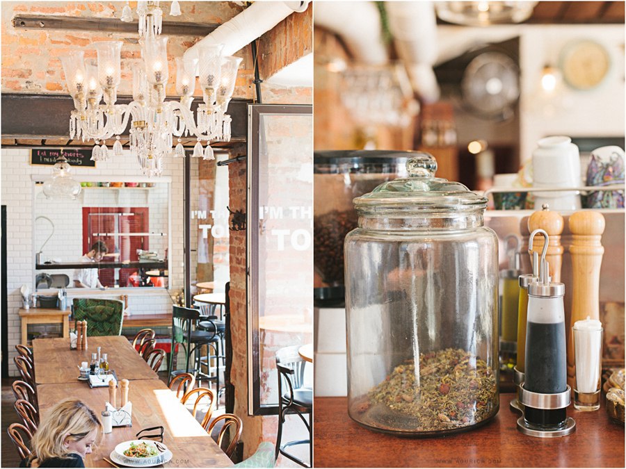
Craft and incompletion thrive, too, in Russia’s urban drink and food scene. Candies, Kamchatka, Lavkalavka, Sister’s Bar, and the like boast one or more of the following: unplastered bricks; white-tiled walls; seemingly mismatching (but minutely selected) vintage furniture; handwritten menus; and quasi-nerdy bearded and/or tattooed waiters. These locations’ (pricey) menus also flirt with austerity. They feature homemade lemonades, plain omelettes, or such Soviet classics as buckwheat kasha. I’m Thankful For Today is a case in point: amidst unplastered walls and chalkboard menus, clients of this Petersburg-based bar sip homebrewed teas, served, in vintage pots, by — yes — tatooed baristas with beards.
I’m Thankful and its likes did not fall out of the sky. They resonate palpably with transnational trends like Slow Food, nouveau rough, rurbanism, and hipsterdom’s love for homegrown, local, organic food. They do not fetishise imperfection as loudly as some colleagues do elsewhere, though. To Russia’s rurban food hipsters, non-polished looks are tool rather than target: they underline a food philosophy that marries the “culturally pervasive” (in anthropologist Melissa Caldwell’s words) Russian concern with natural foods to the post-Soviet habit of commodifying “Soviet retro”. (Added benefit: they conveniently laud “our” Russian kitchen as indecorous-but-tasty alternative to hi-tech — and sanctioned — western fast food.)
Tigran Avetisyan
Jacket (2015 S/S Collection)
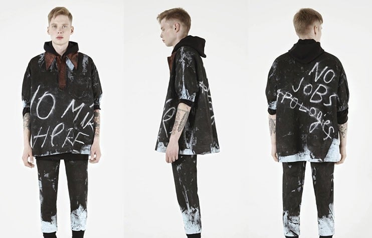
You find Pussy Riot punk? Have a look at Tigran Avetisyan’s Spring/Summer 2015 collection. A graduate of London’s Central Saint Martins, Moscow-based Avetisyan crafts quasi-sloppy, wrinkly, bulky clothes. He shares with such pioneering fashion names as Vivienne Westwood and Martin Margiela an aesthetic of cracks, scraps, and trash. Punk — which Avetisyan sees as catalyst for innovation — inspired his unique selling point: the gloomy texts he writes on his garments in paint and chalk (“No Jobs”, “Stop Dreaming”).
Russian politics is, as Avetisyan explains in interviews, not on this designer’s “radar”. He does cater into a preoccupation with “poor” looks among post-Soviet creatives — the type of scantness-lauding art and design, that is, that the resonant 2008 show Russian Poor thematised. Curator Marat Gelman then exhibited post-Soviet art and design made from “the ‘poorest’ materials”. To him, the makers’ choice for iron, cardboard, and coal illustrated nothing less than the “social responsibility” of Russian art. Avetisyan’s “aesthetics of poor” is socially driven, too: his infatuation with labour and wealth division feeds directly into the current transnational, Piketty-esque furore for neo-marxism.
Vera Pavlova
Letters to the Next Room (2006)
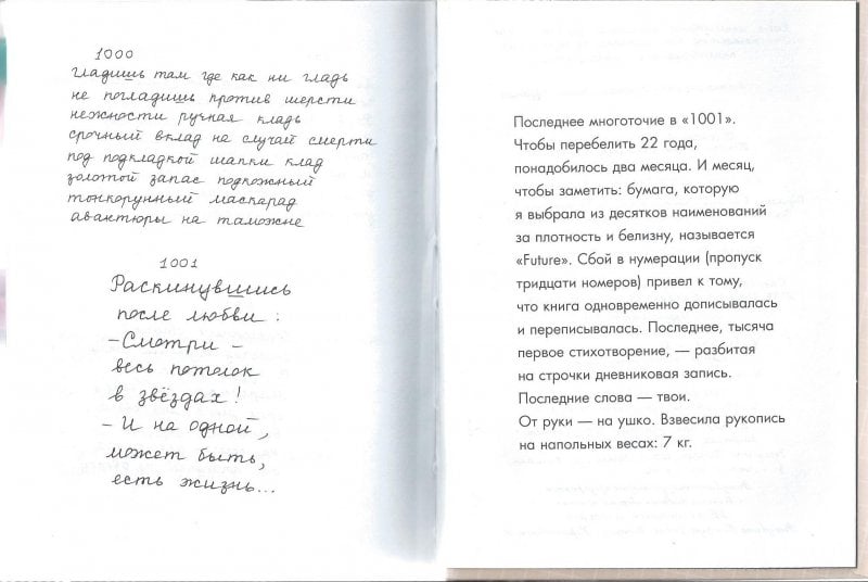
Mikhailov, the Taiga tenants, I’m Thankful’s owners, Avetisyan: each celebrates quasi-sloppy handwriting, whether on drawings, walls, menus, or shirts. In her (handwritten!) verse collection Letters to the Next Room, Vera Pavlova turns handwriting into a theme of its own. This poem frames “beautiful handwriting” as “a caress”, and the risk of writing wrongly as part of that all-too-human caress.
Human imperfection versus “dead” machine perfection: that old dichotomy (Ruskin exalted it in the 1850s) flourishes in contemporary discourse about writing. As .docs substitute notebooks, and typelabs replace handwriting lessons, we witness a cultural fascination with vintage fonts and handwriting. Writers embrace typographic fiction. Geeks hype typos as antidote to “soulless” spellcheckers. Diners praise the “authentic” feel of handwritten menus. Stationery sellers idolise the “raw tactility” of pencils.
These and other non-automated writing aficionados — so media scholars argue – turn handwriting into a hallmark for human authenticity in a new-media age. They do so with vigour in Russia. Russian Futurists already ascribed to handwriting a creative “liberation and irregularity”; and Soviet dissidents fetishised handwritten and shoddily typed samizdat texts as tokens of intellectual integrity. Russian creatives revive their cults of the handwritten in response to digitisation. Not fortuitously does Pavlova call handwriting a “sincere” alternative to digital fonts.
InLensk
Obratno EP, Ekaterinburg (2015)
Siberian music producer InLensk (Gena Volgarev) dedicated Obratno EP to his native village of Lensk. Formative to the album are hardware noise and bugs. In InLensk’s words, it recreates his memories “through the prism of urbanism, through a constant stream of sounds, glitch and drums… as if I am recalling echoes of my memory in a city enveloped within a rapid torrent of information”.
InLensk’s love for glitch aesthetics — he likes “the effect of glitch” and wants “to use it on a larger scale” — fits a pattern. Cassette label Klammklang, Echotourist collective, Poetronics festival: these are three names from a long list of Russian music initiatives to which glitches and distortions are asset rather than taboo.
“Cracked media” — music and art boasting an “underground…feel, while using new high-tech tools” — are no 21st century find: “imperfect aesthetics” (critic Ted Gioia’s term) already dominated modernist jazz. But the same aesthetics are especially pervasive in this age of “sublime technologies”. In our hi-tech age, electronic music and arts profess “failure aesthetics”, “reminding us that our control over technology is an illusion”; and in cinema, “deliberate imperfections” (so cultural historian Nicholas Rombes argues) foreground “the human hand guiding the camera”.
Avdotia Alexandrova
Lumpen Modeling Agency, Moscow (2014-today)
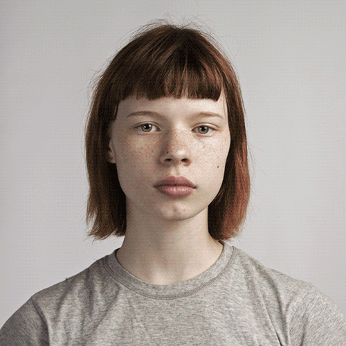
#ImPerfect: fashion brand Esprit’s 2015-2016 slogan. #LoveYourimperfections: Dutch dating site Lexa’s motto. #NoFilter: a campaign by skincare line Olay. As critics loudly persuade us that today, “everything is mediated”, PR experts equally loudly promote non-polished looks, “ragtag” authenticity, and — in a legendary Dove cosmetics campaign — “real beauty”. With her agency Lumpen, Avdotia Alexandrova starts where Dove stops. Rather than standard models, Lumpen casts “unusual types”. Her shoots are lovingly stylised anti-fashion and anti-glamour statements that mirror the glitchy chic that hipsters practise worldwide. And in Moscow, where she is based, her use of gender-fluid and ethnically diverse models strike a blow for tolerance and inclusivity in an increasingly xeno- and homophobic society. Like Avetisyan, or, say, designer Gosha Rubchinsky, Alexandrova “casts outcasts” — a transnational modelling trend that intensifies as philosophers plead against genetic perfection.
Lumpen and its like naturally meet distrust: aren’t commerce-induced pleas for lopsided looks hypocritical — or downright patronising? “The subconscious message”, so one Dove critic complains, “is that beauty is still what defines women”. Alexandrova is subtler. Her team is conspicuously “white”, yes, and she rejects straightforward ugliness (to her, her models are “amazingly beautiful”). But Lumpen does take what fans call a “badly needed” Russian “step towards appreciating the different”.